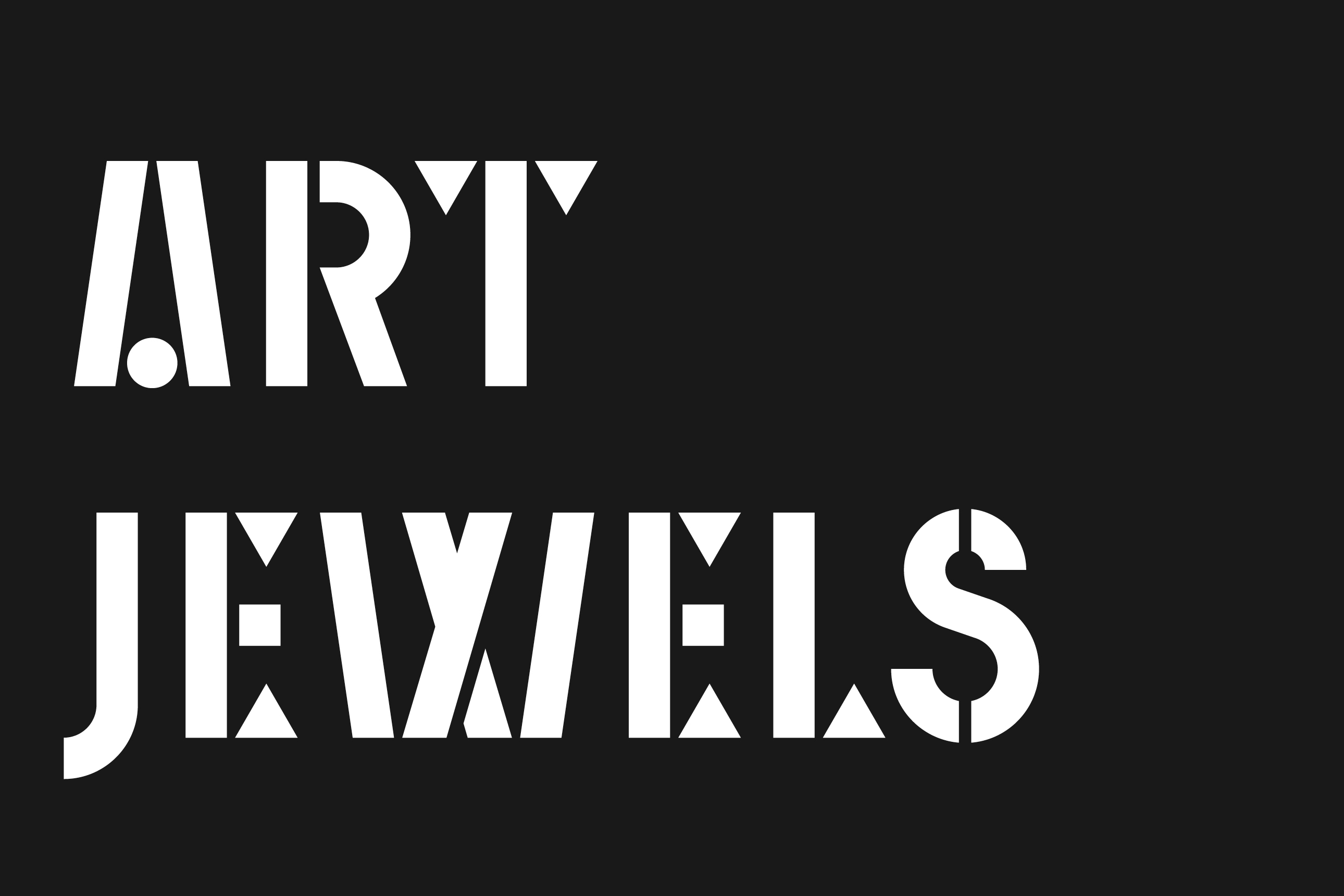
Muggenburg Grotesk Neue
Belmacz’s bespoke typeface, Muggenburg Grotesk Neue, debuted to coincide with the launch of this new Belmacz website. The typeface is an evolution of the previous Belmacz typeface, Muggenburg Grotesk — itself heavily inspired by the typeface Kino MT.
The original Muggenburg Grotesk was designed by the Swiss designer Andy Lang in 2006 while working at Mind Design, London. The typeface Kino MT was very influential. It was designed by Martin Dovey for Monotype in 1930. It features unique triangular serifs and is a display typeface (The name Kino is the German for ‘cinema’). These forms were redesigned and rationalised to become geometric — some characters were designed from scratch using this new new direction. It was originally designed for a poster but quickly become the title typeface for all of Belmacz’s output.
During the design of the gallery space in 2011, an existing cabinet in the doorway became an opportunity to create an old fashioned announcement board for exhibitions. A modular set of brass letters (see images below) was manufactured to be displayed in the cabinet. The moveable, individual letters are reminiscent of classic cinema displays. Muggenburg Grotesk was altered slightly during this process so that it functioned as a working stencil in brass.
In the years since it seemed logical to evolve Muggenburg Grotesk into a stencil, since the forms are so close already. The commissioning of the new Belmacz website in 2018 proved the right moment. And so Muggenburg Grotesk Neue was conceived.
Another central consideration in the evolution was the typefaces legibility onscreen. The original Muggenburg Grotesk featured some round letters clipped at the top and base. Although it adds a unique character, it doesn’t allow for easy reading as the basic lettershapes lack variation. Muggenburg Grotesk Neue would introduce more rounder characters (C, G, D) inspired by the existing round ‘O’ and ‘Q’. All the other characters were created using and remixing a basic kit of parts. The new shapes became more inline with traditional grotesk lettershapes. Care was taken to retain some of the more idiosyncratic elements so the typeface evolved but remained within its lineage.
Craig Sinnamon, 2018
Bespoke title typeface for Belmacz
Design: Craig Sinnamon
-
![]()
-
![]()
-
![]()
-
![Kino MT by Martin Dovey (for Monotype Corporation), 1930]()
Kino MT by Martin Dovey (for Monotype Corporation), 1930
-
![Muggenburg Grotesk by Andy Lang (at Mind Design), 2006]()
Muggenburg Grotesk by Andy Lang (at Mind Design), 2006
-
![Belmacz window display with modular brass stencil letters.]()
Belmacz window display with modular brass stencil letters.
-
![Belmacz window display (detail)]()
Belmacz window display (detail)
-
![Comparison of Muggenburg Grotesk and Muggenburg Grotesk Neue. The O-shape is stencilised and its round shapes form the basis of the new G.]()
Comparison of Muggenburg Grotesk and Muggenburg Grotesk Neue. The O-shape is stencilised and its round shapes form the basis of the new G.
-
![Some letters received minor tweaks whereas others have transformed to a more classic grotesk form.]()
Some letters received minor tweaks whereas others have transformed to a more classic grotesk form.
-
![Many of the flat areas at the top and base are replaced with rounder, traditional forms to increase legibility.]()
Many of the flat areas at the top and base are replaced with rounder, traditional forms to increase legibility.
-
![Transformation of Kino MT to Muggenburg Grotesk to Muggenburg Grotesk Neue.]()
Transformation of Kino MT to Muggenburg Grotesk to Muggenburg Grotesk Neue.
-
![Transformation of Kino MT to Muggenburg Grotesk to Muggenburg Grotesk Neue.]()
Transformation of Kino MT to Muggenburg Grotesk to Muggenburg Grotesk Neue.
-
![Transformation of Kino MT to Muggenburg Grotesk to Muggenburg Grotesk Neue.]()
Transformation of Kino MT to Muggenburg Grotesk to Muggenburg Grotesk Neue.
-
![Transformation of Kino MT to Muggenburg Grotesk to Muggenburg Grotesk Neue.]()
Transformation of Kino MT to Muggenburg Grotesk to Muggenburg Grotesk Neue.
-
![Lighter punctuation details for better character recognition.]()
Lighter punctuation details for better character recognition.
-
![Core characters of Muggenburg Grotesk Neue.]()
Core characters of Muggenburg Grotesk Neue.